Talabat
Setting the brand identity architecture for talabat.
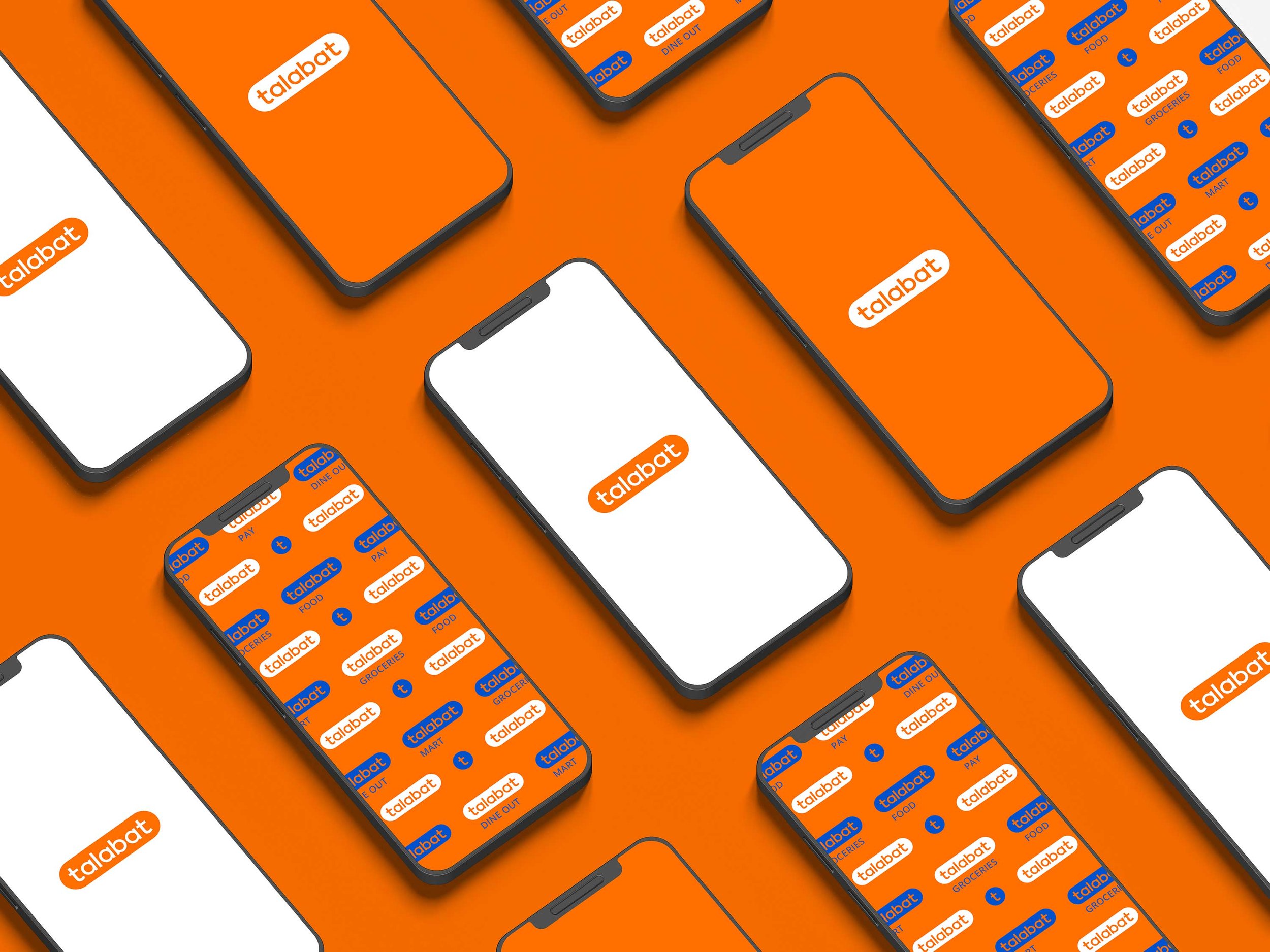
“Talabat’s rebrand focused on refining its brand positioning with a fresh perspective, establishing a cohesive brand architecture and design system for the future—while maintaining its bold, energetic, and approachable identity.”
A Friendlier, More Approachable Logo
As part of Talabat’s brand evolution, the uppercase "T" was transformed into a lowercase "t", giving the logo a softer, more approachable feel. This subtle yet impactful change enhances warmth and accessibility, making the brand feel more friendly and inviting while maintaining its strong recognition. The refined typography aligns with Talabat’s mission to be a seamless and welcoming platform for all.
A Bold and Dynamic Color System
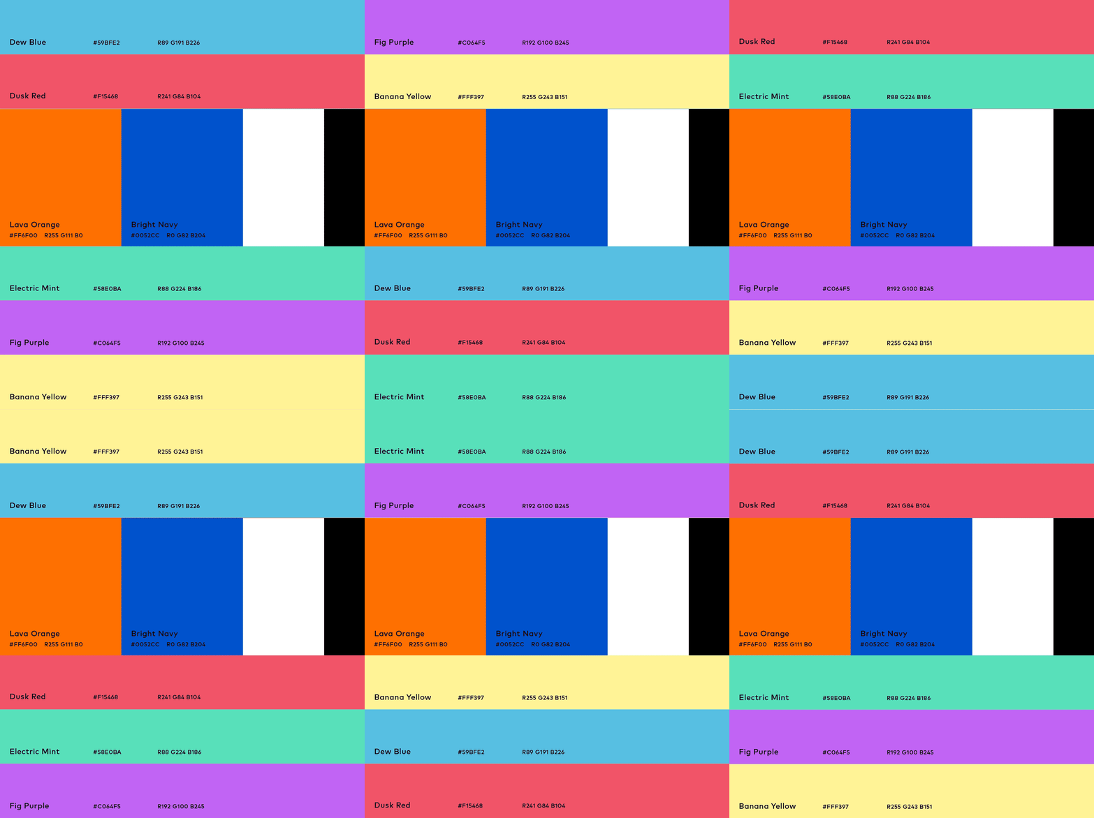
Talabat’s refreshed identity is anchored in Lava Orange, a vibrant hue that brings warmth and familiarity to the brand, complemented by Bright Navy for contrast and balance. A dynamic secondary palette—Electric Mint, Fig Purple, Banana Yellow, Dew Blue, and Dusk Red—enhances the UI, adding flexibility while maintaining brand cohesion. This refined color system ensures a bold, youthful recognizable identity that adapts seamlessly across all touchpoints.
A Unified and Adaptive Layout System
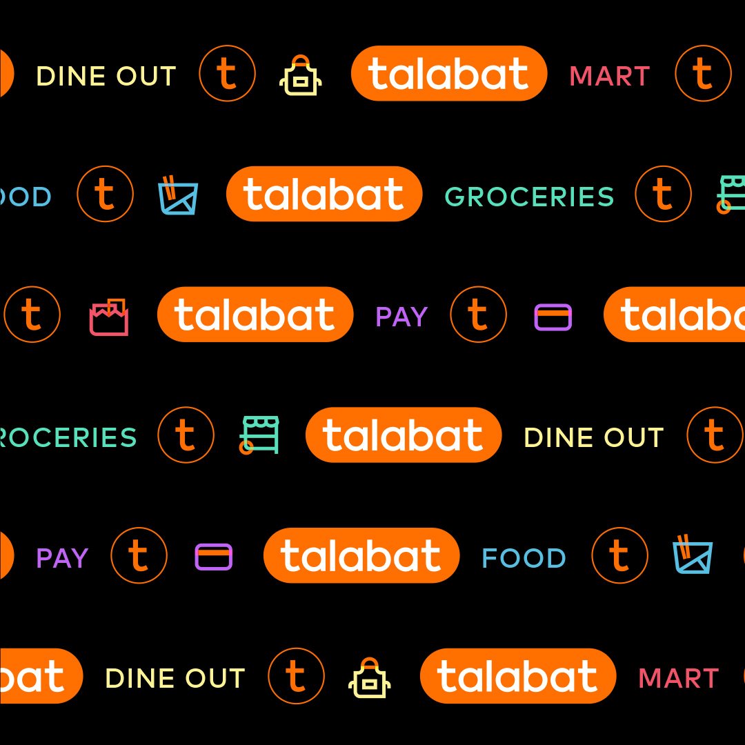
Designed from the base of the "t", Talabat’s modular content frame creates structure while adapting seamlessly across all aspect ratios. By making the "t" the cornerstone of the brand’s visual identity, the system ensures clarity, consistency, and a strong presence across every touchpoint.


The strategic integration of these key refinements—uplifting the logo, the modular “t” framing system, a bold and structured color palette, and a unified design approach—collectively strengthens Talabat’s brand identity, ensuring consistency, adaptability, and a distinct visual presence as it moves forward.




Brand Architecture Strategy // Hierarchy Development // Naming System // Visual and Verbal Framework // Sub-Brand Alignment // Consistency Guidelines // Color System Hierarchy // Adaptive Design //
Brand Architecture Strategy // Hierarchy Development // Naming System // Visual and Verbal Framework // Sub-Brand Alignment // Consistency Guidelines // Color System Hierarchy // Adaptive Design //

